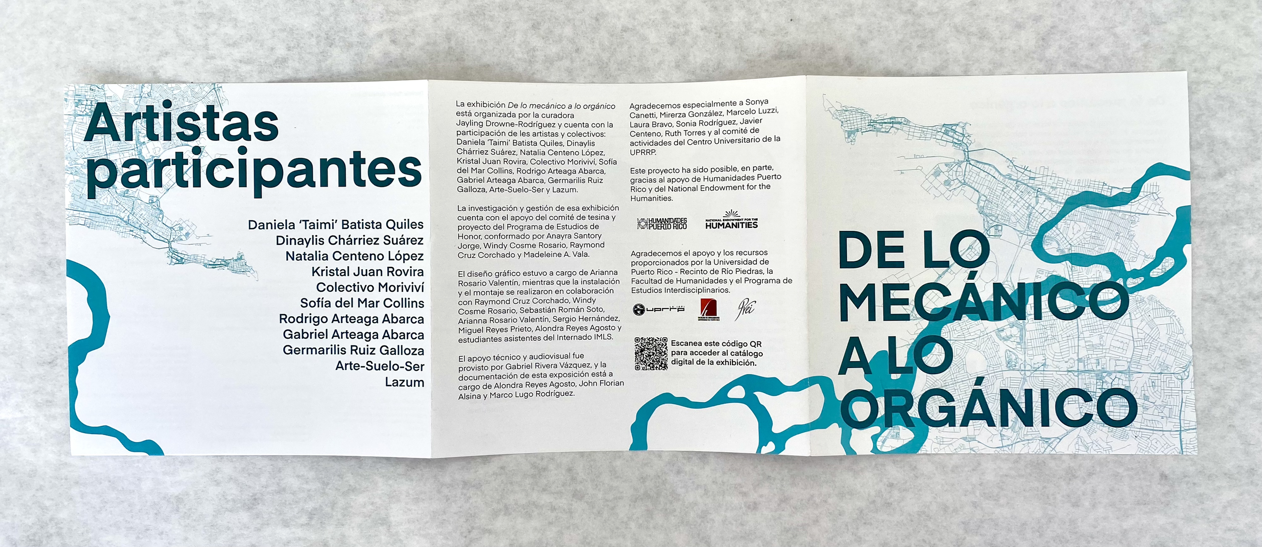
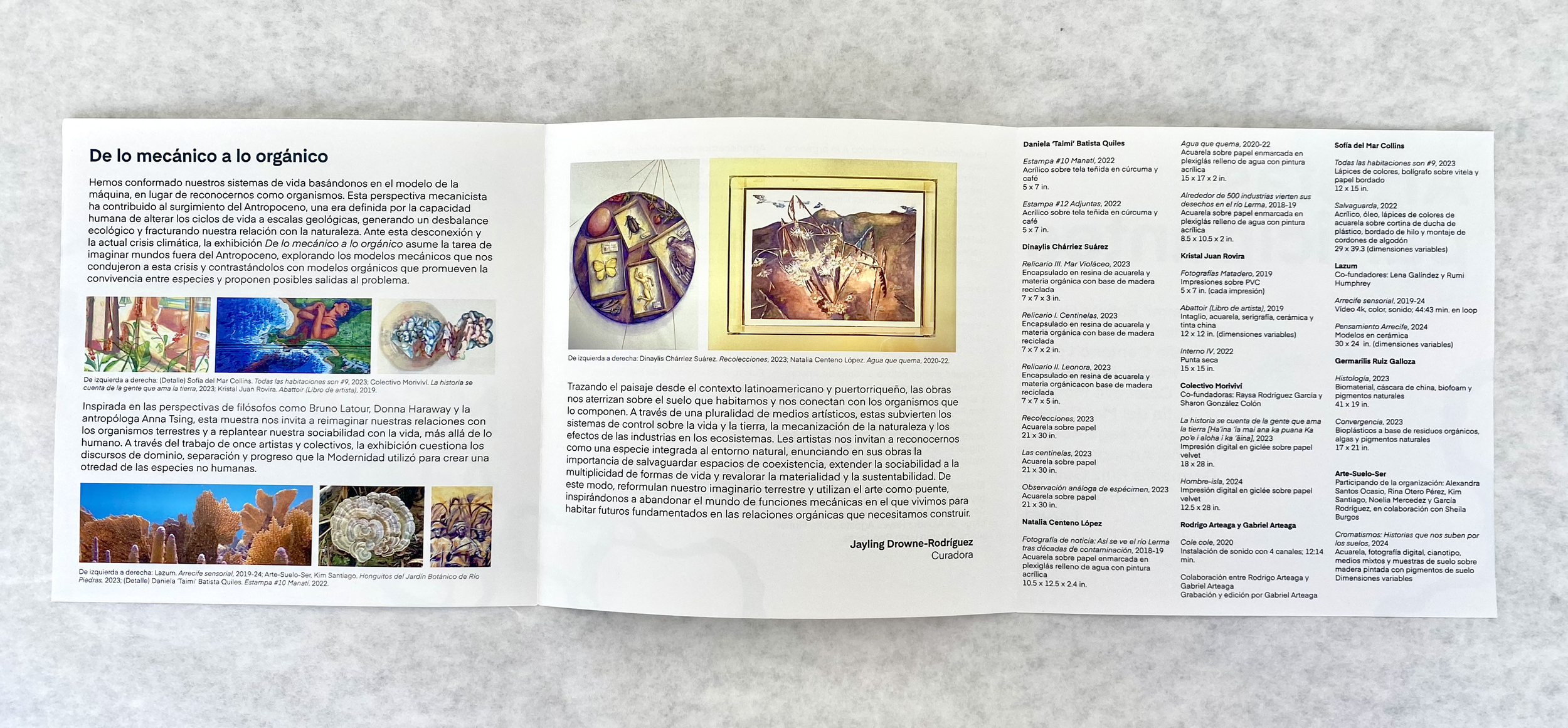
DE LO MECÁNICO a lo orgánico
Visual identity design, branding, and product design
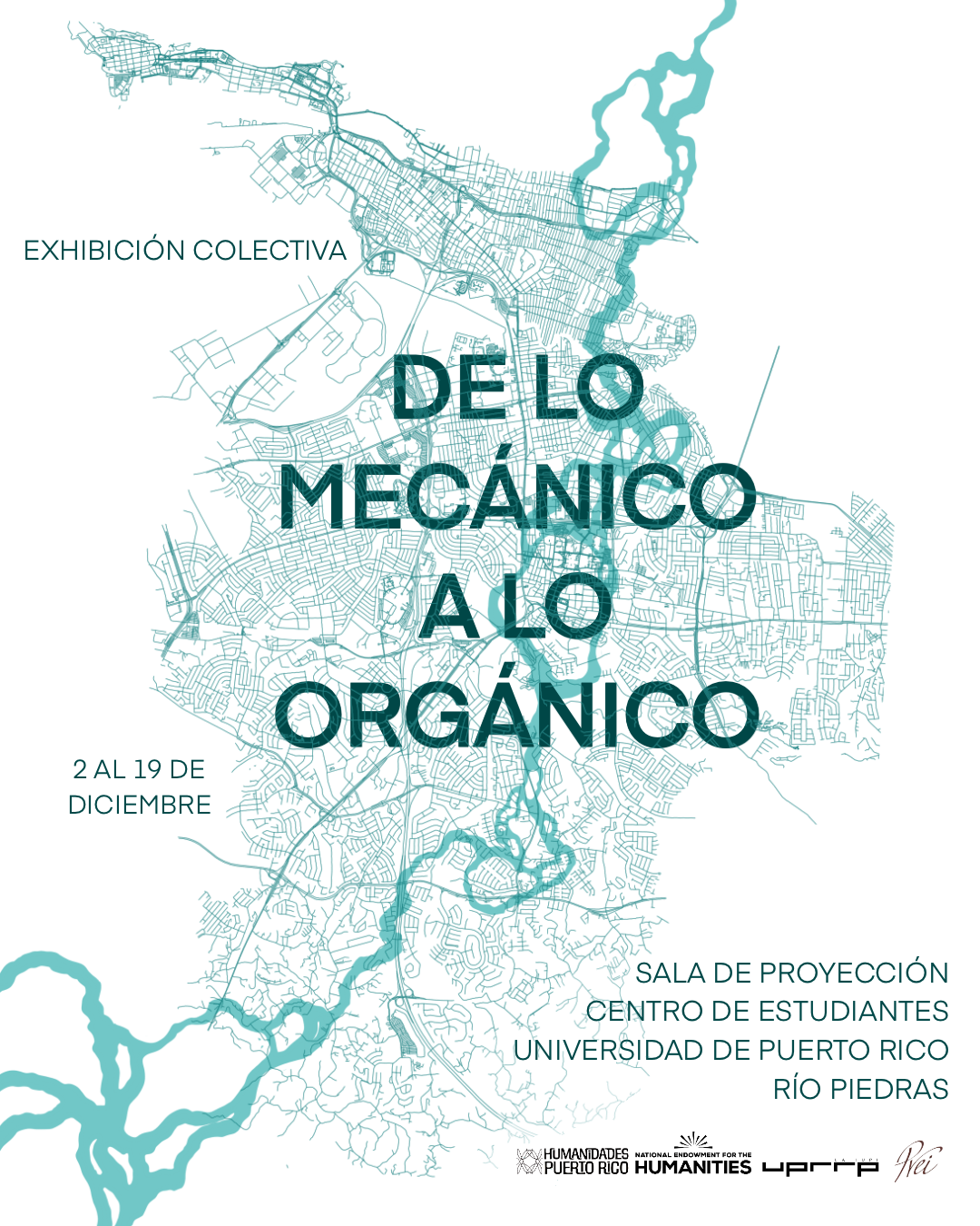
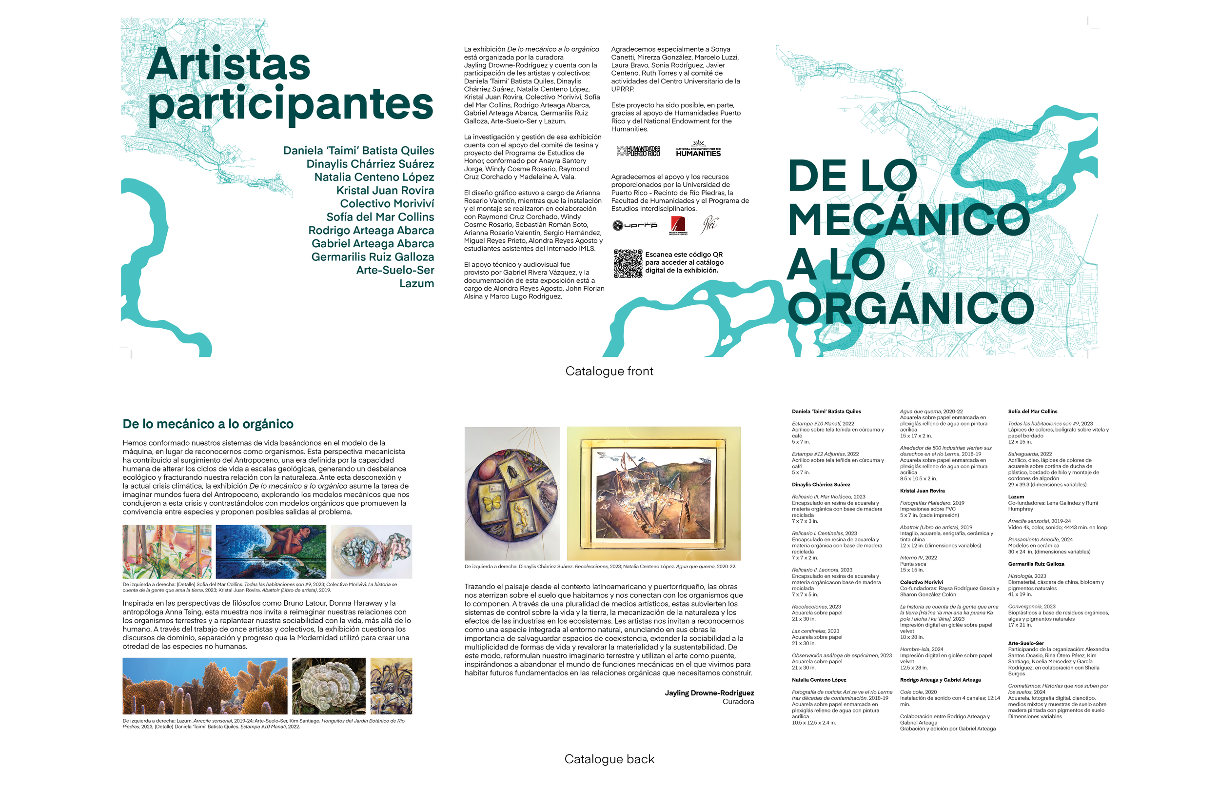
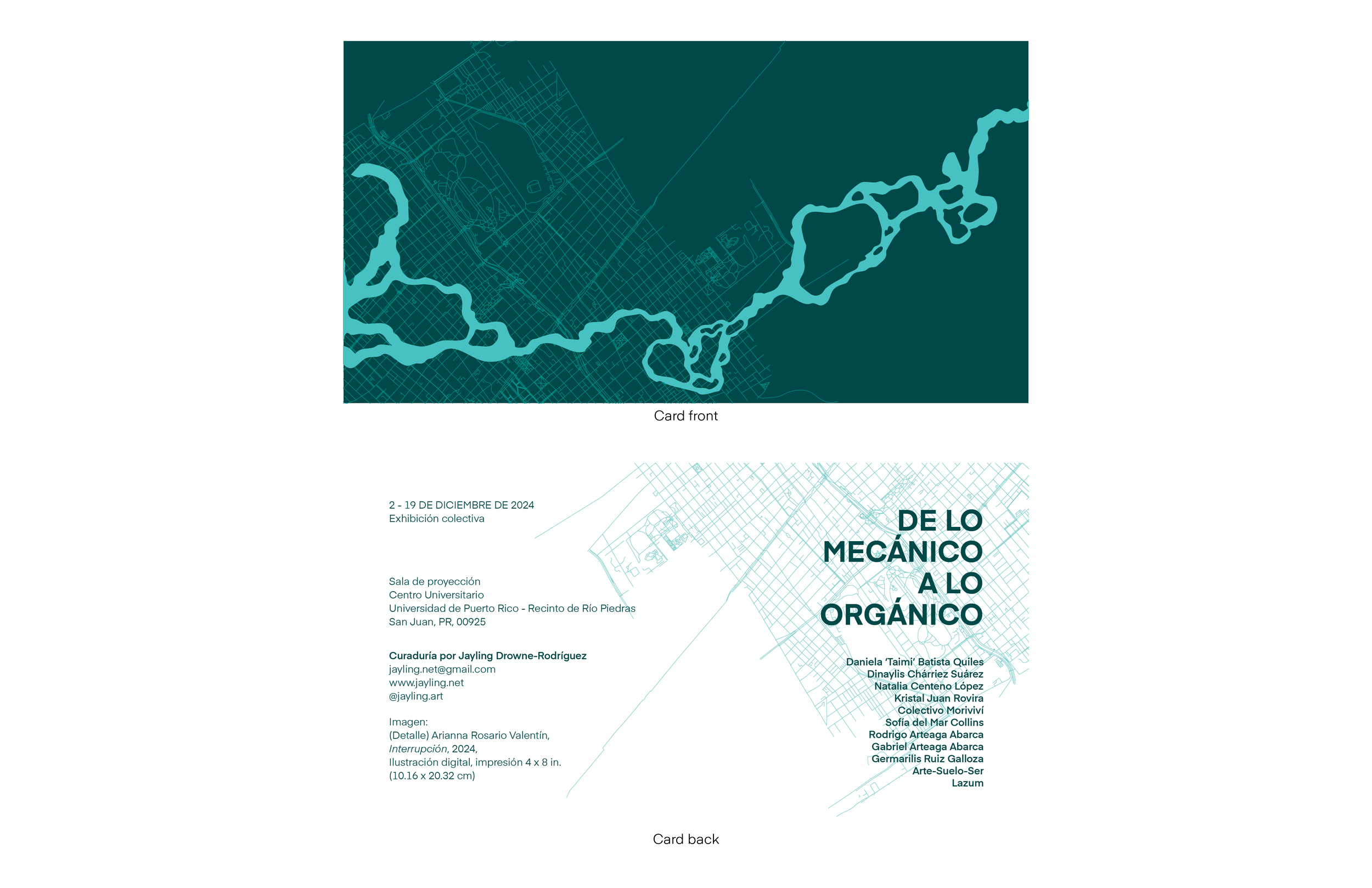
De lo mecánico a lo orgánico, an art exhibition based on the contradictions present between the natural and modern worlds. The curator, Jayling Drowne-Rodríguez, wanted an elegantly subtle, yet direct approach to the subject matter. We decided to place the contradictions presented in the exhibition front-and-center, without being too on the nose.
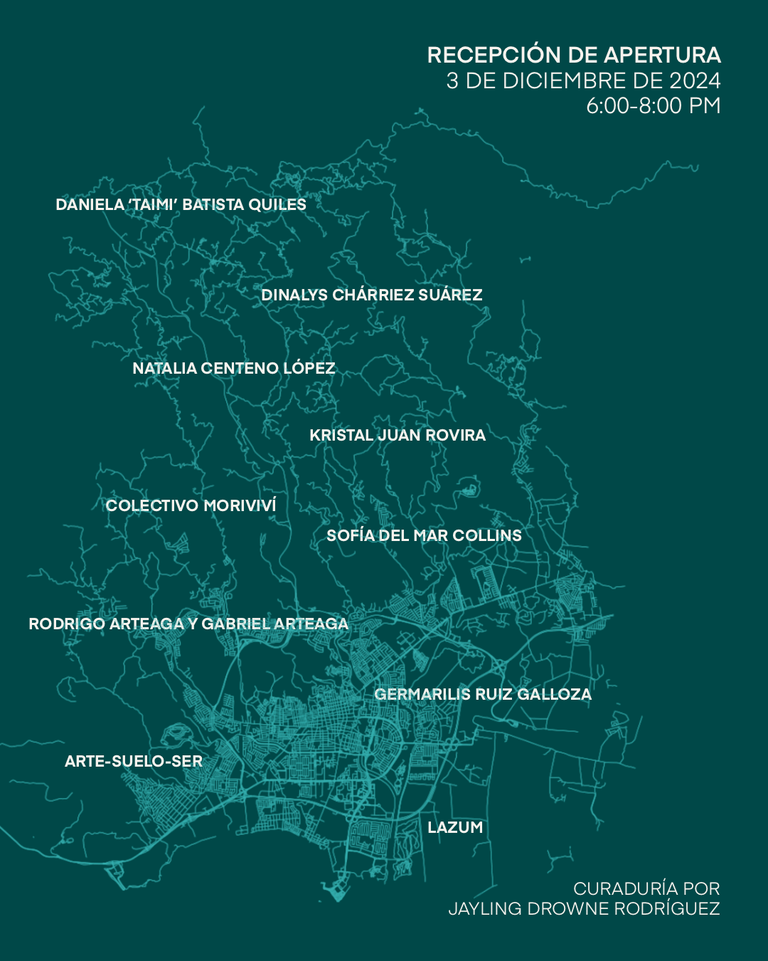
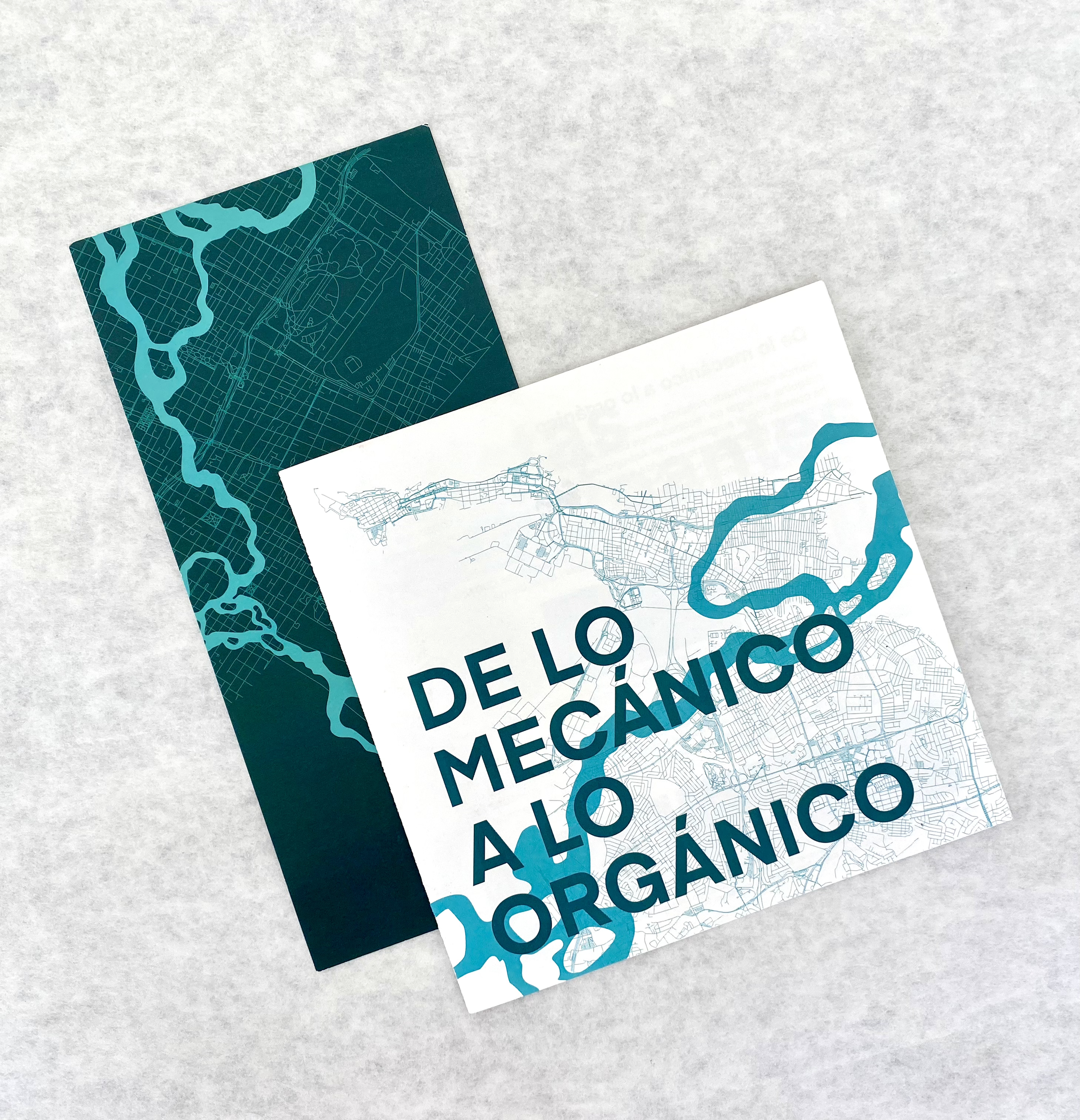
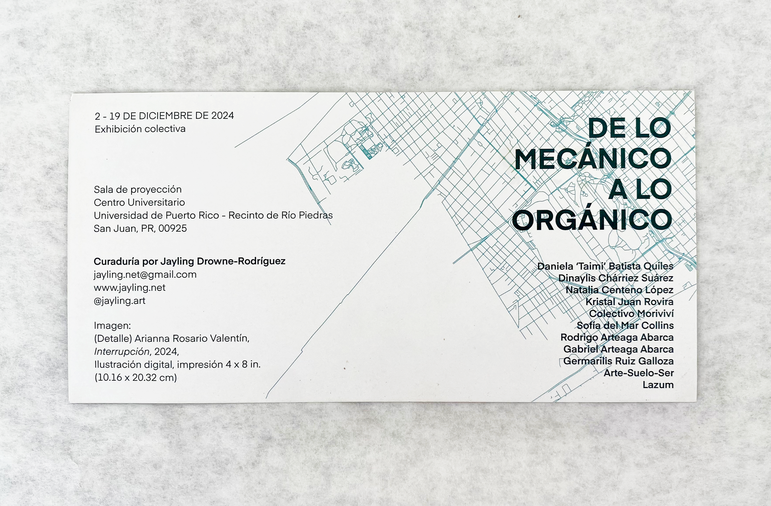
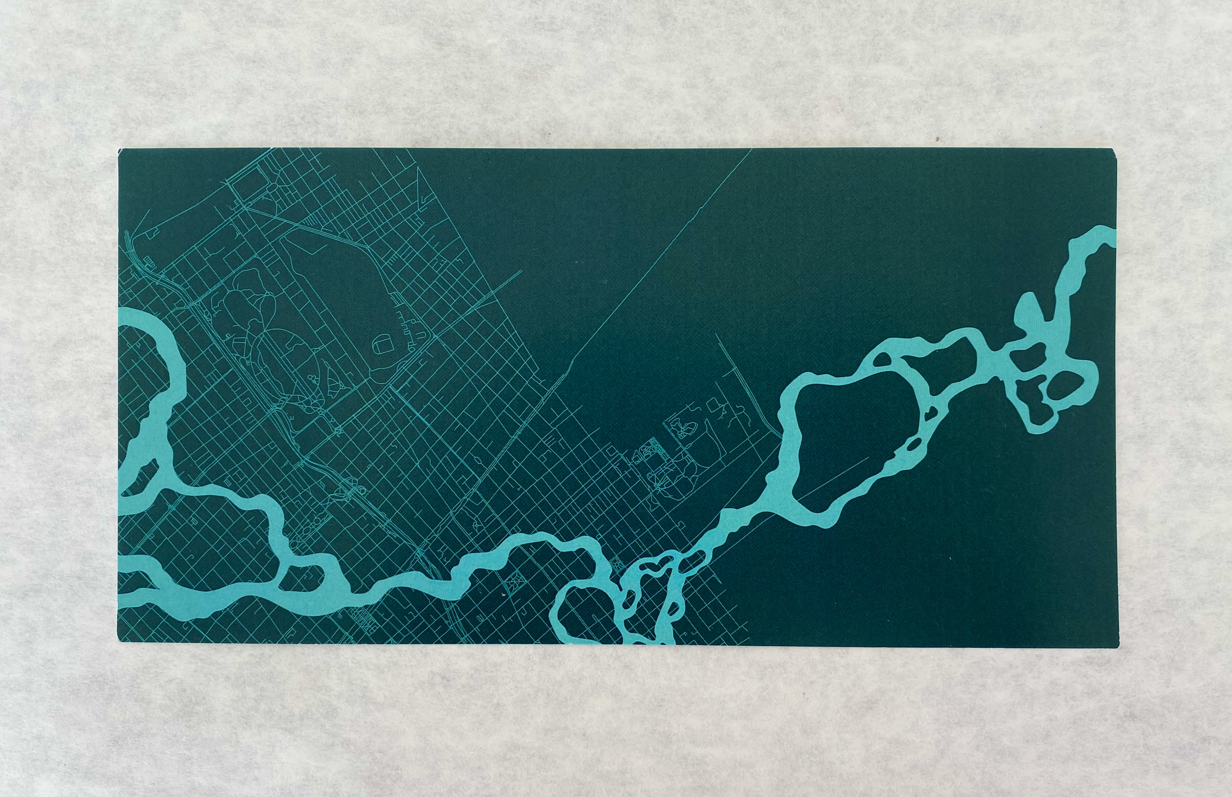
After some back and forth, we decided to go with hand-drawn and later vectorized river motifs to be juxtaposed over hard-line city roadmaps (namely San Juan, Ponce, and Santiago de Chile, representative of the artists’ birthplaces) to create contrast that is firm, but never soft-spoken. Drowne, an eternal lover of teal, also wanted this color to be present in the design concept. We took that as an opportunity to showcase how teal can symbolize water, healing, and life.
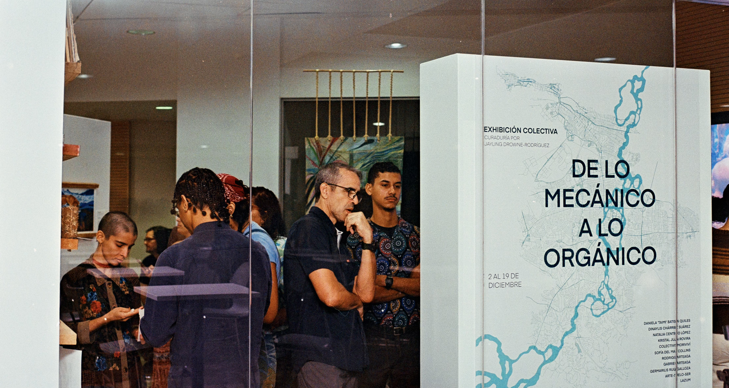
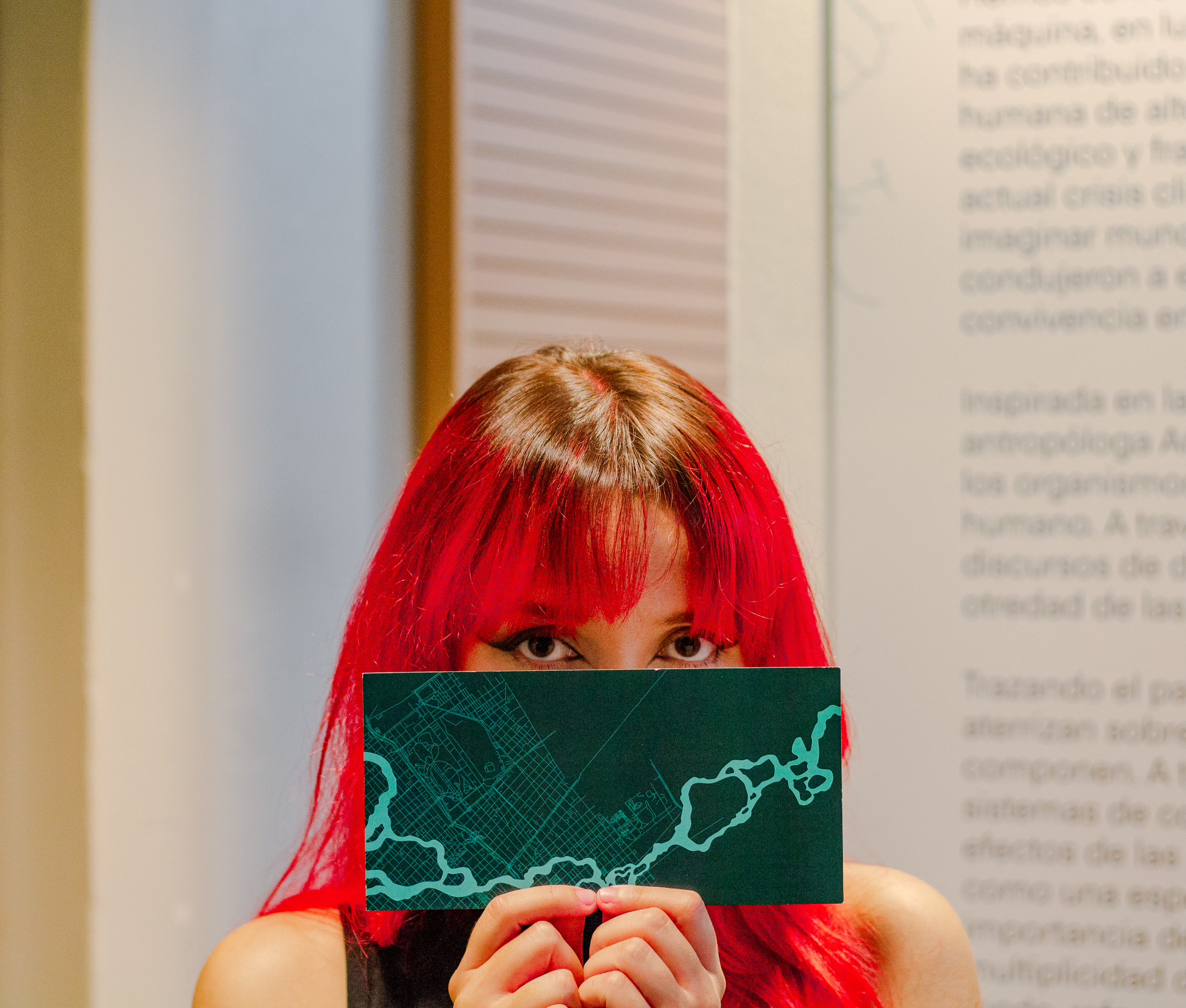
This collection of images starts with social media promotions: in this case, for Instagram, followed by snapshots of the much-awaited opening night (that’s me with the red hair, holding up an invitation). The invitations are 5” x 9”, and the catalogues were, originally, 10” x 10”. After hearing from the printers that they could only accommodate an 8” x 8” approximately two days before opening night, we worked quickly to adjust the design to meet the impending deadlines and ensure the opening went off without a hitch.